CARD LINK
<CardLink>card-link.tsxDefault Fixed Image Cards
The default image mode uses a fixed h-80 media region with masked image treatment and automatic description clamping.

Stealth
Ping if you want to chat, love to jam.
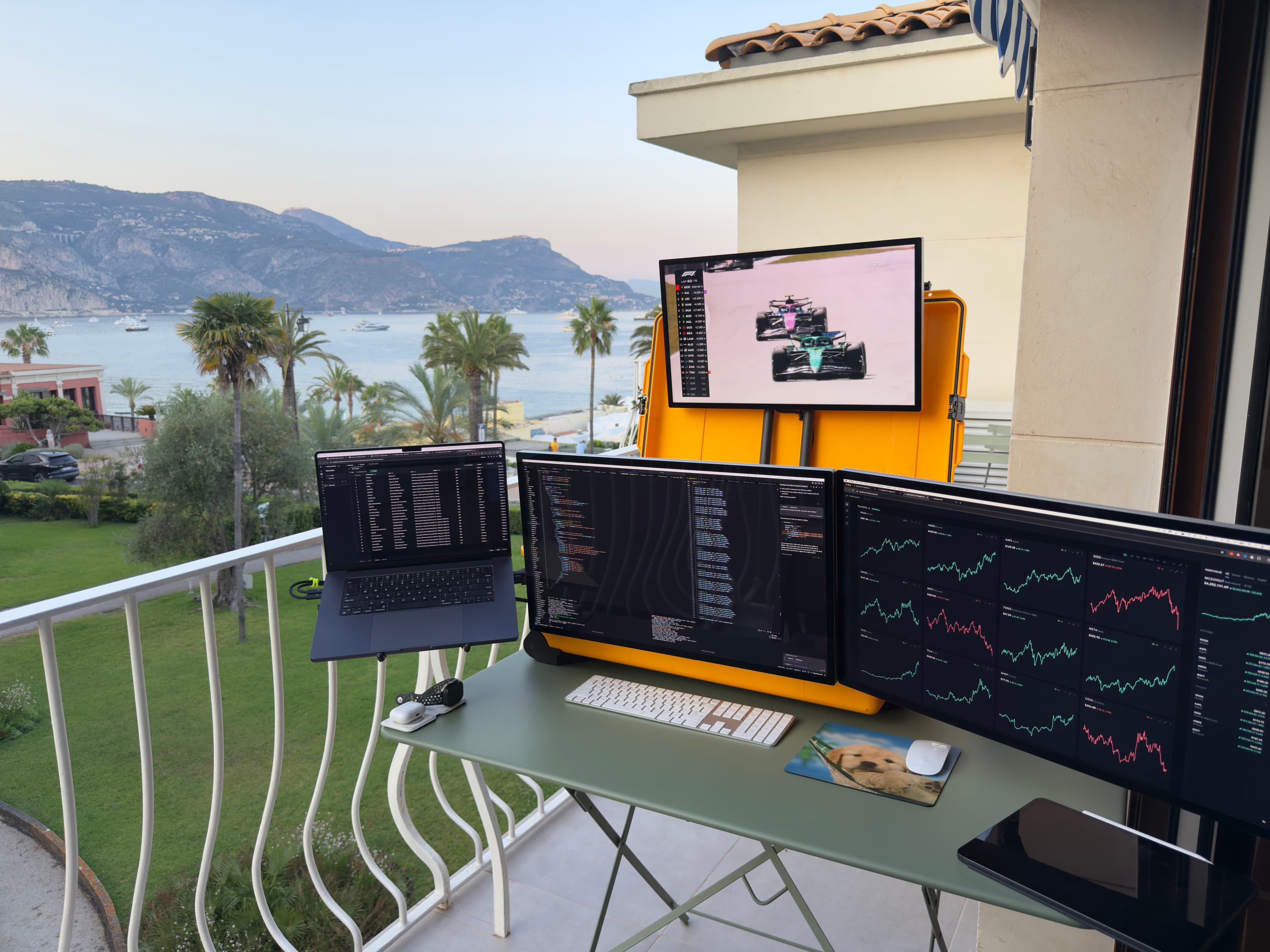
Megadesk
Traveling battlestation of monitors I built to work from anywhere.

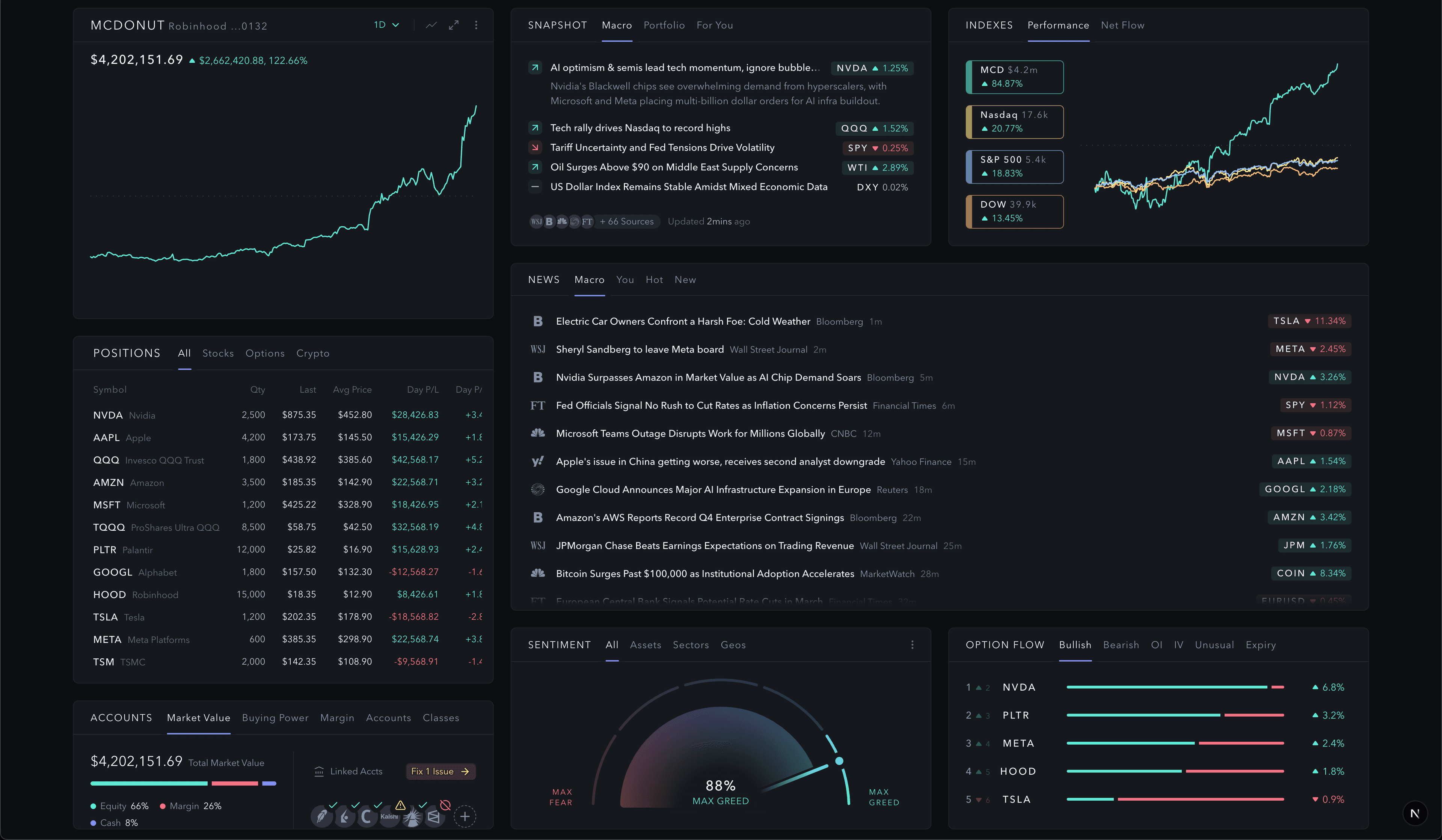
TheMcDonuts.com
Got married this summer and built an overkill website for fun.
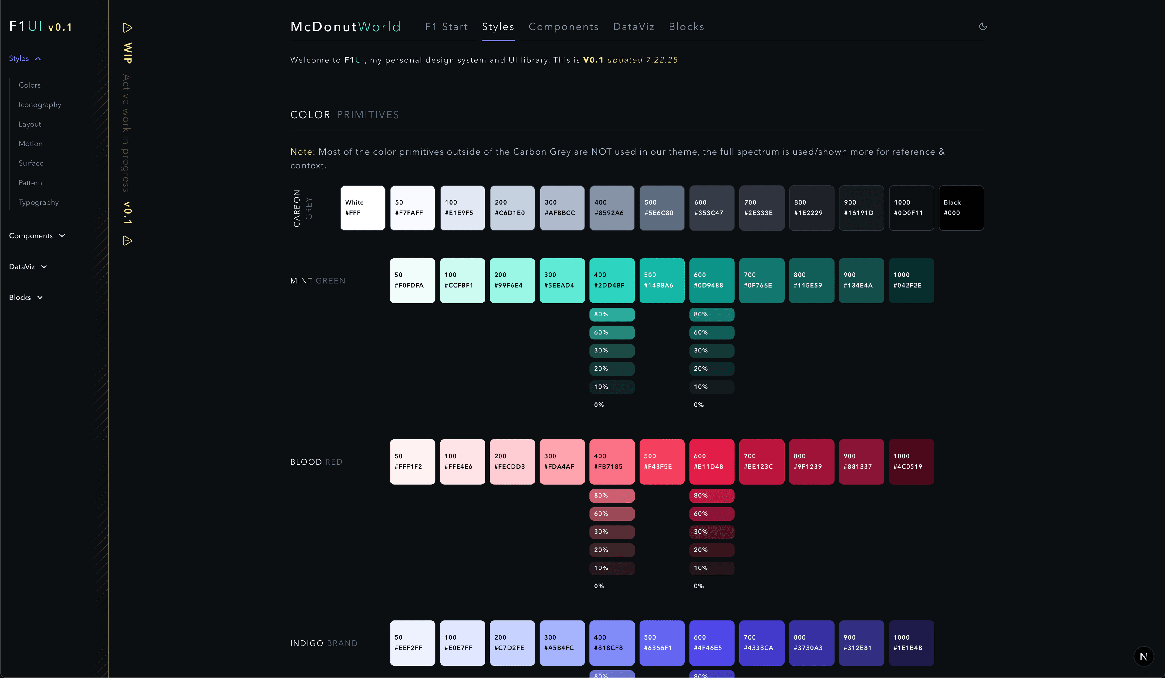
F1 Design System
Design system, component library and OS for a personal AI product studio. This intentionally runs long to show how fixed cards clamp body copy.
Image Treatments
CardLink.Image supports masked, bordered, and clean media treatments without rebuilding the card shell.
Masked
Bottom fade blends image into content.
Bordered
Divider line separates media from content.
Clean
No fade or border for contained artwork.

Text-Led
A quieter example that still keeps the link-card rhythm.
Aspect Mode: Short
Aspect mode switches the image region to 16:9 so media scales with the card width.
Stealth
Ping if you want to chat, love to jam.
Megadesk
Traveling battlestation of monitors I built to work from anywhere.
TheMcDonuts.com
Got married this summer and built an overkill website for fun.
F1 Design System
Design system, component library and OS for a personal AI product studio. This intentionally runs long to show how fixed cards clamp body copy.
Aspect Mode: Narrow Columns
Four-column cards stress-test tight title and description truncation.
Cols 4 / 16:9 / Short
Single line description truncated nowrap.
Cols 4 / 16:9 / Base / Double Line Title
Multi-line description available below the image until it reaches the bottom of the card.
Cols 4 / Logo / Clean
Contained artwork can opt into clean treatment.
Cols 4 / Photo / Bordered
Bordered media keeps photo cards crisp in dense grids.
Aspect Mode: Three Columns
Three-column layouts give aspect cards more breathing room and show the taller height variants.
Cols 3 / 16:9 / Short
Cols 3 / 16:9 / Base
Design system, component library and OS.
Cols 3 / 16:9 / Basemid / Double Line Extra Long Title
Multi-line description available to fill the card below the image until it reaches the bottom of the card.
Height Variants
Fixed image mode with the commonly used CardLink height scale.

Short
Compact card for quick views.
Base
Standard height for most card grids.
Base Mid
A bit taller for more content. This height shows additional description text while staying scannable.
Base Tall
More vertical room for cards that need extra supporting context.
Tall
Maximum height for richer content. The description can occupy more lines before truncating.
Dashboard Placeholder Grid
A final mixed grid using the dashboard and construction placeholders from the old sandbox intent.
Dashboard Sample
Masked image treatment with a dashboard placeholder.
Dashboard Aspect
The same placeholder in aspect mode.

Construction
Dark construction placeholder for WIP cards.
Overflow Badges
BadgeRow handles long metadata lists with horizontal overflow and edge fades.